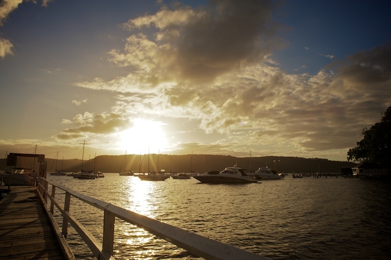
On the pier at Paradise Beach
I like the lens correction feature in Lightroom 3, but in this photo I like the distortion way better. I think the vignetting complements the distortion…both are adding to the bulge around the outside. I especially like how the wide-angle distortion effect makes the things coming at the camera look like they’re getting stretched and pulled…like the Millenium Falcon about to go hit warp speed.
Compositionally, I like how the pier railing forms a diagonal line off to the side. However, I’m unhappy about not knowing what the next step of that is. Like…I know various things about what makes good composition and what makes good graphic design…but I’m lacking something that can pull it all together for me in my head so I understand it holistically.
