Japan's Design Culture
Ever since I found out about Japanese toothpicks - I have been watching out for other interesting Japanese designs.
Japanese design, particularly of every day objects, is something I find pleasing. Good design promotes efficiency as a social norm. In a society like Japan where people live in dense areas, and time is so scarce, these cultural norms are extremely important for cities to function.
The care is in the details
I started with the humble toothpick.
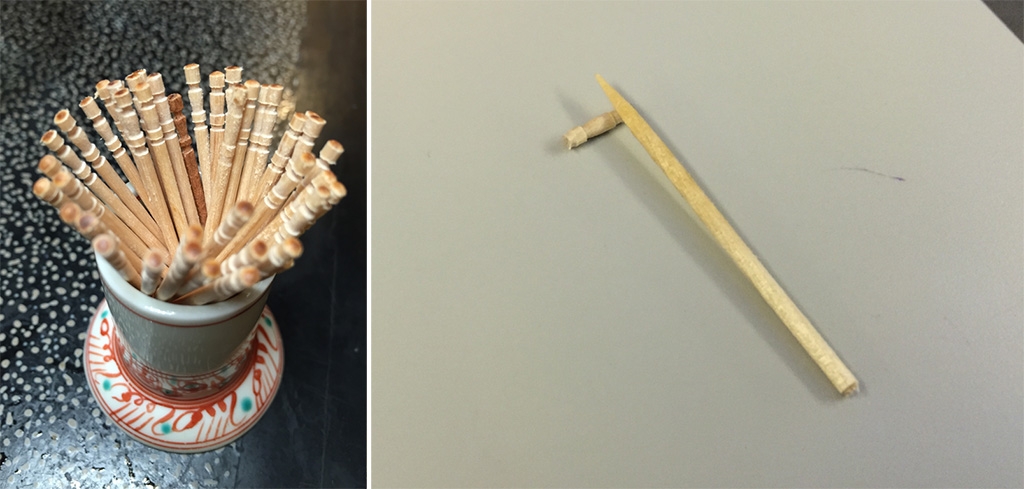
The Japanese toothpick is designed so that the end of it can be easily snapped off.
This indicates this commodity object is now someone’s property.
But most interestingly, the newly snapped-off end can now be used to lift the toothpick off the table so it can be re-used.
This type of thinking about eating utensils extends to soup spoons as well. The spoon that comes with ramen has a little hook at the end that stops it from falling back into the bowl.

There are many examples of minor conveniences - all adding up to reduce overall friction. Recycling bins next to vending machines. Machines to check you in and out of hotels. Parcel delivery to the airport rather than your hotel.
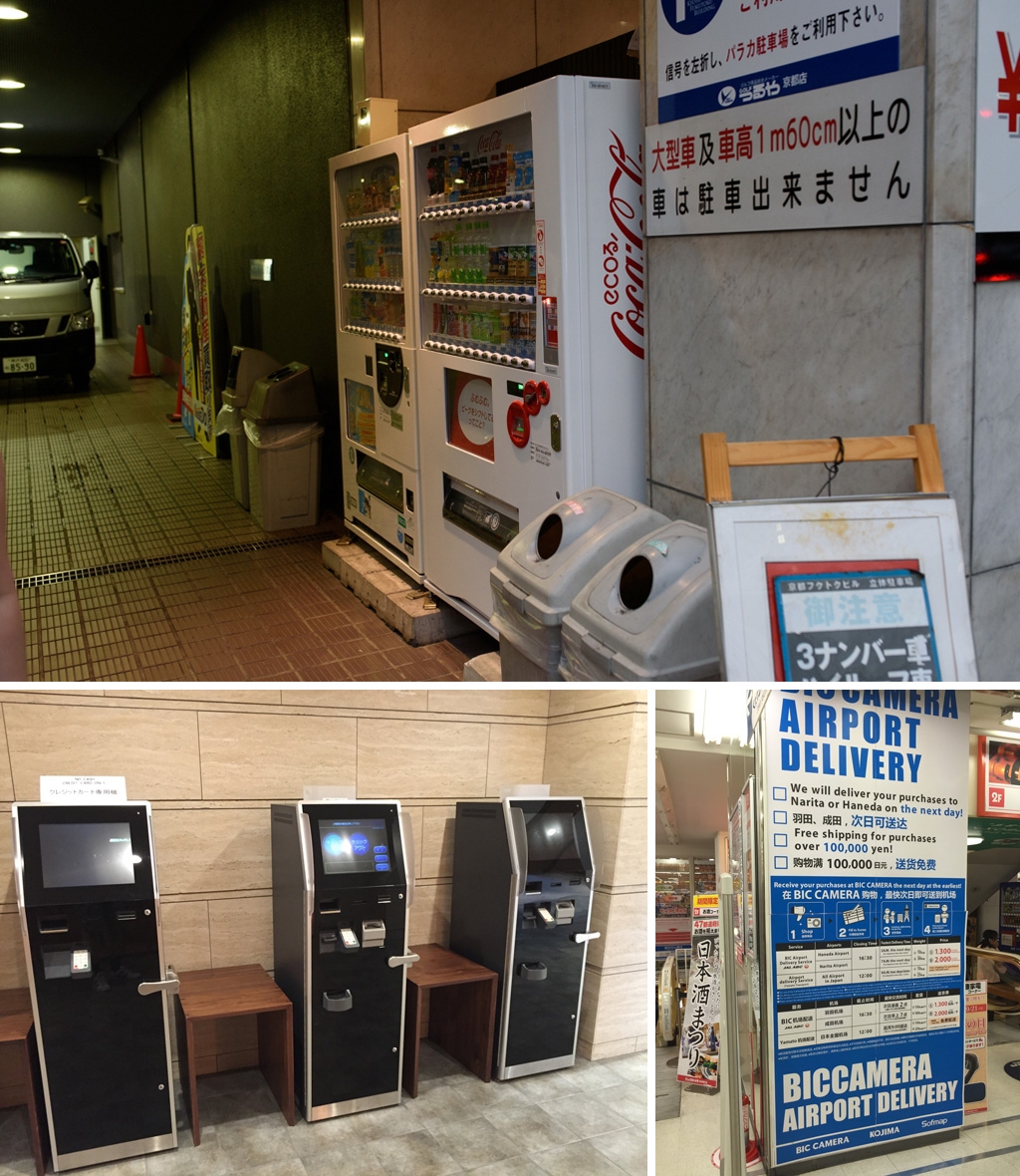
The existence of these little things all indicate a culture where people think things through. Everything is designed with intent right down to the minor details.
And along with conveniences, there is real efficiency gains that are achieved.
Below is a queue area for a bank teller which has an overflow area across the path way.
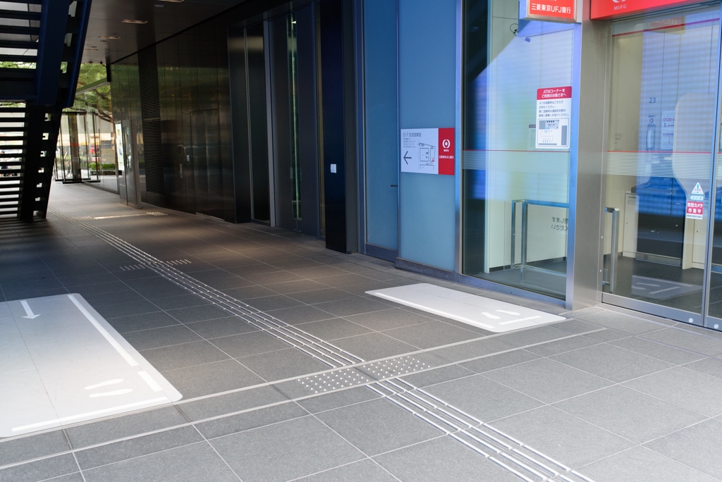
How often do you have to walk around a queue of people, just standing around, in Sydney?
A cohesive society - precedure and order
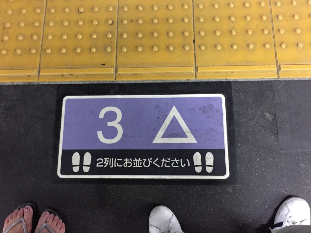
This is a diagram at a metro train platform that tells you which carriage you should use to be closest to the exit at every station along that train line.
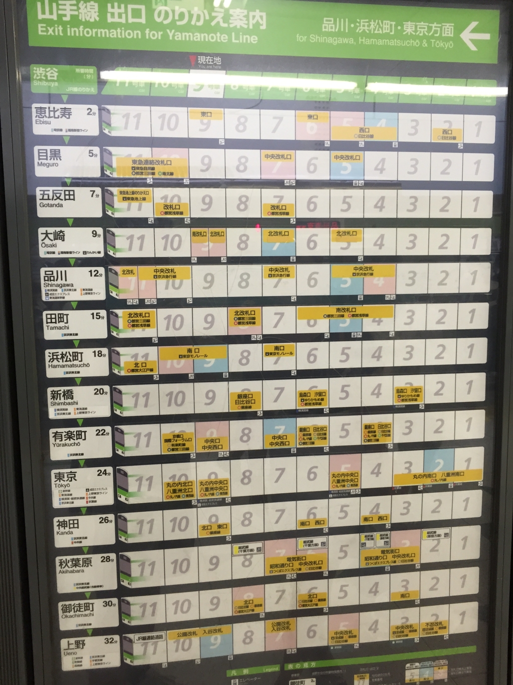
And then clearly marked is where you should line up so you are simultaneously close to your train carriage door but also not in the way of people exiting the train.
As a small aside, if you catch a bullet train, you will see the train guards performing this ritual. I researched that they do this because pointing at the items you are checking reduces human error. This dance looks ridiculous to an outsider, but it demonstrates the commitment to following well thought-out procedures with precision and purpose.

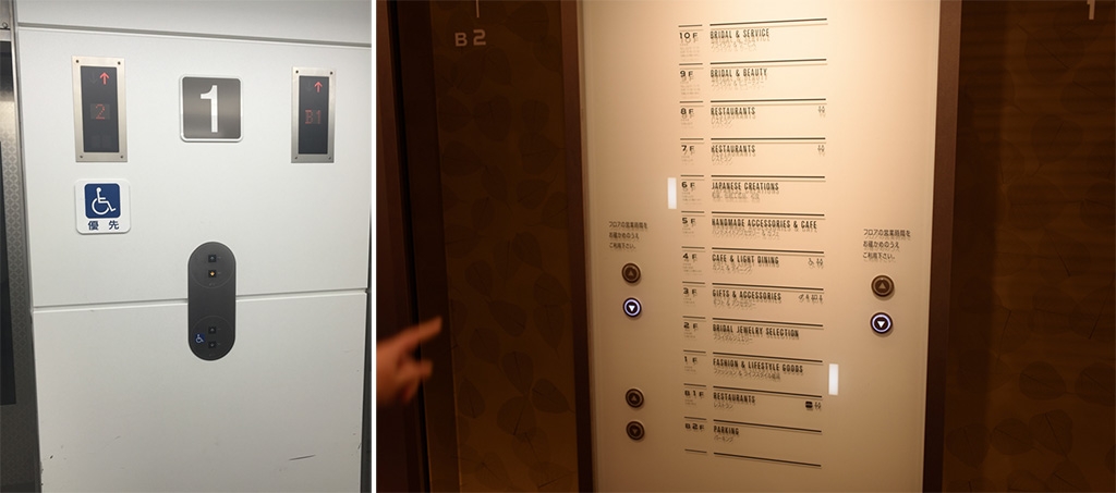
There are also important conveniences for people who use wheelchairs and need the lower buttons (at every lift I used in Japan).
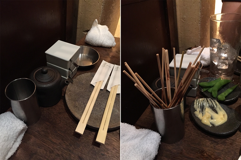
This dedication to order and procedure extends to eating as well. Everything has its place.

Other tidbits
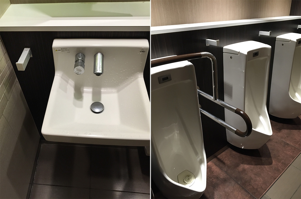
There is always somewhere to put your bag.
In restaurants…
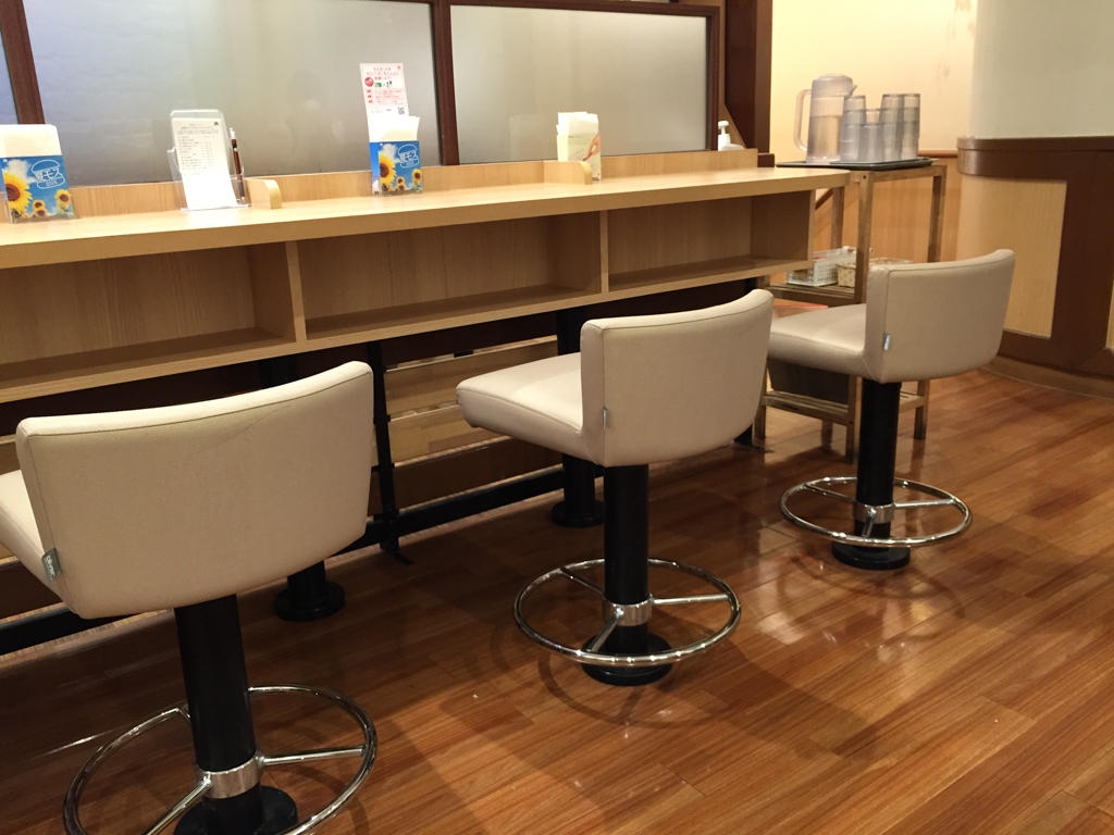
…and toilets. And yes, they’re extremely clean toilets! - I saw people using the shelves and hooks all the time.
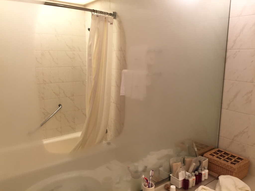
Heated mirrors so you don’t have to wipe it off after a shower.
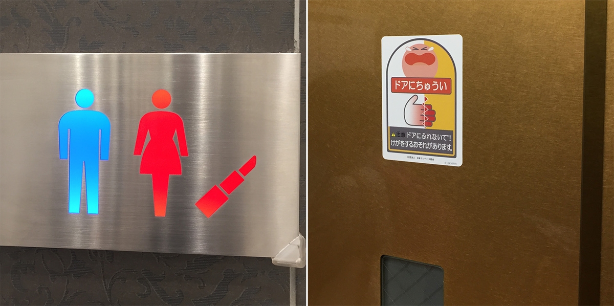
I thought the signs were rather amusing (and often sexist).
Some are just so detailed even foreigners can figure it out.
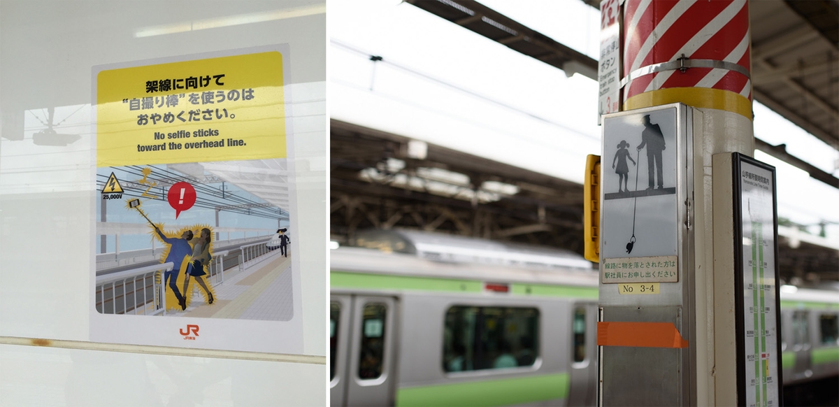
Other times, they’re just whimsical…
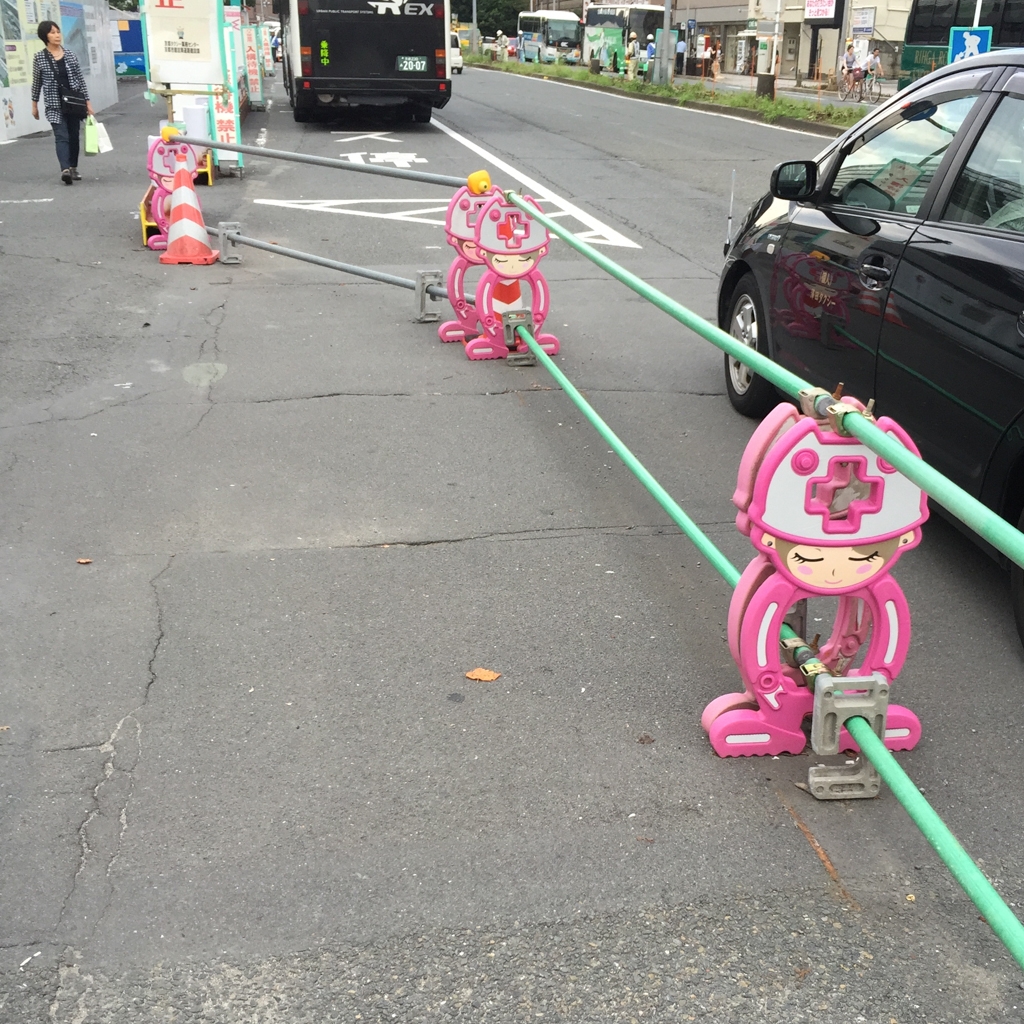
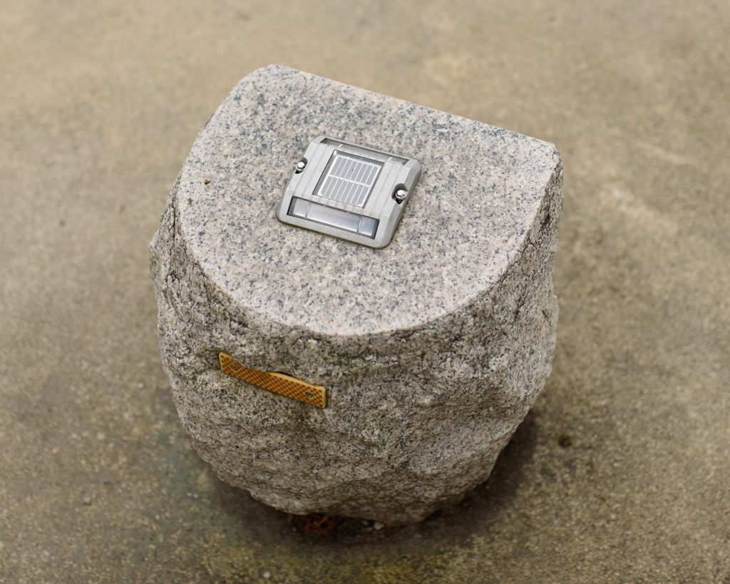
…but often, functional. Why put a solar powered light here, because you need it…and you can.
Bad design - why Sydney trains run late when it rains, when the sun is shining, when there is a breeze, when somebody coughs…
If you need an example of bad design, just get on board a Sydney Cityrail Train.
You will experience the common phenomenon of seeing the person boarding in front of you stepping onto the train and then suddenly freezing in place.
After a good 5 seconds, they move into the train.
Then as you recover from almost walking into them (and stopping the queue of people behind you), you step onto the train, you look up, and you suddenly freeze too.
This ritual repeats itself as each person boards the train. The freezing is more common amongst the non-frequent commuters and tourists.
Why?
The complete list of possible places to sit/stand after entering a Sydney Cityrail Train:
- Left
- Left crevice
- Forward
- Forward left crevice
- Forward right crevice
- Right downstairs
- Right upstairs
- Right in between up and down stairs
- Right crevice
- Middle
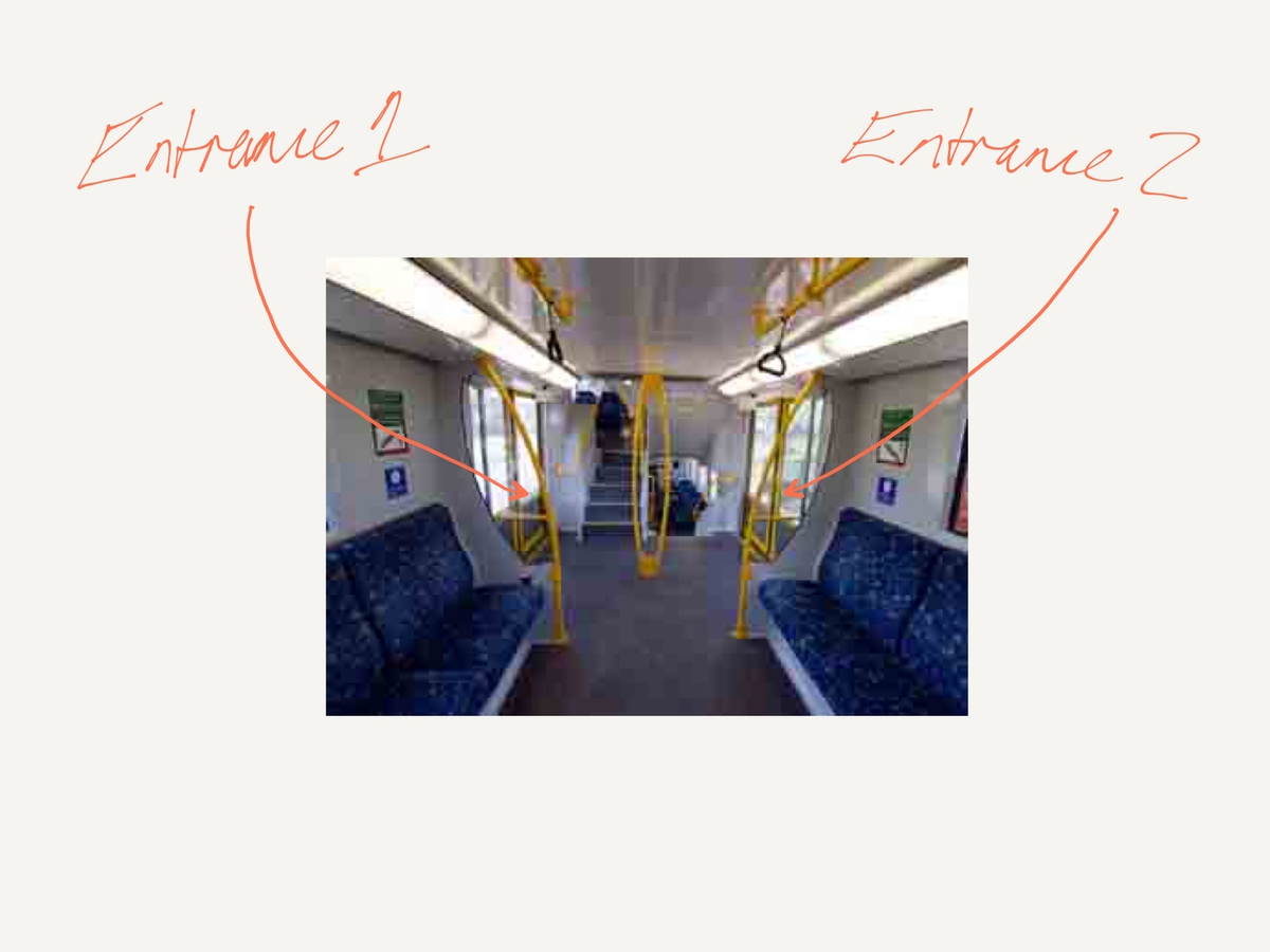
This shit would not be tolerated in Japan.