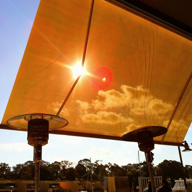
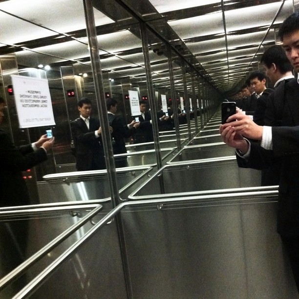
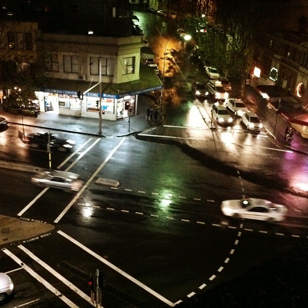
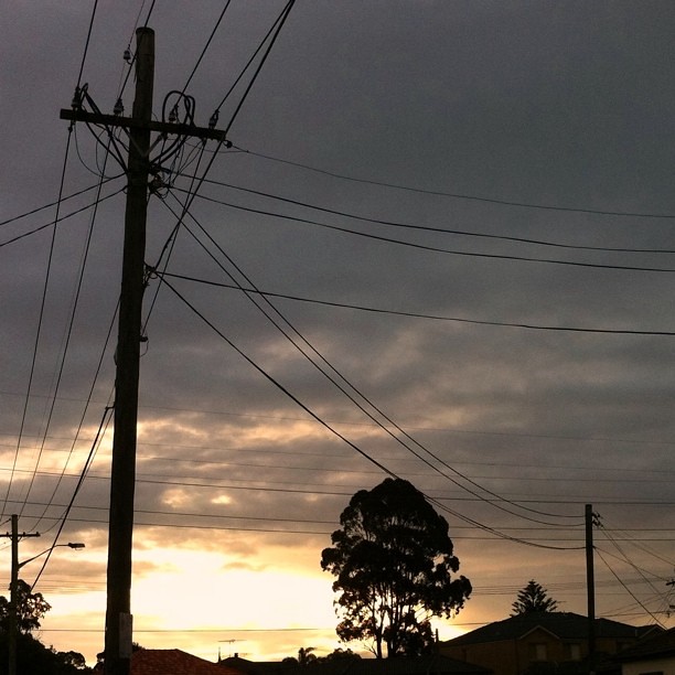
A study in composition with the iPhone 4
I wrote a post a while back stating how useful a tool the camera phone is in studying composition. The iPhone 4 with its apps makes it great for post processing the photos as well. It truly is a great “camera”.
Also around this time I decided that to learn to take better photos, I needed to take more photos. Lots of photos. But with a purpose. And I had to use a camera that was with me all the time. So born was the Instagram project.
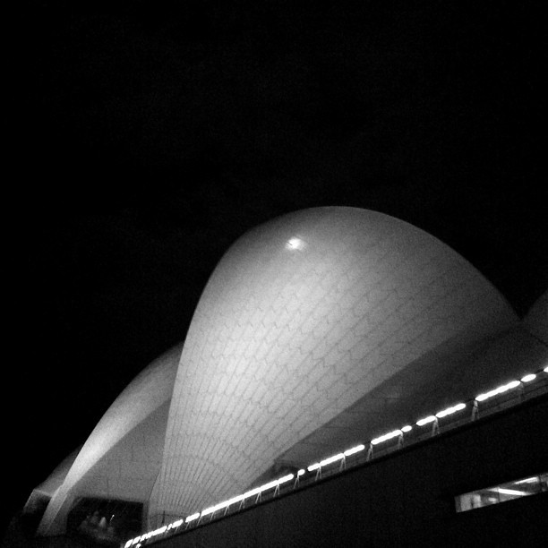
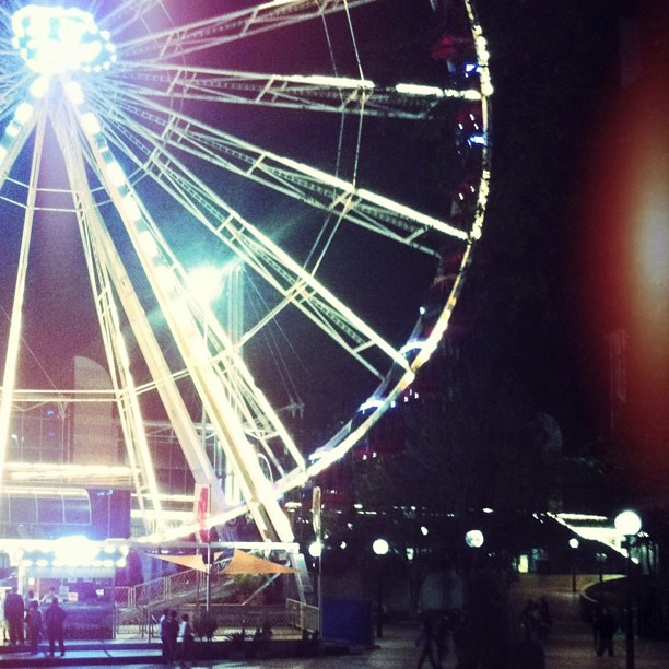
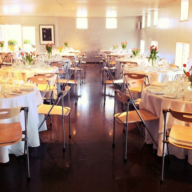
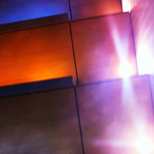
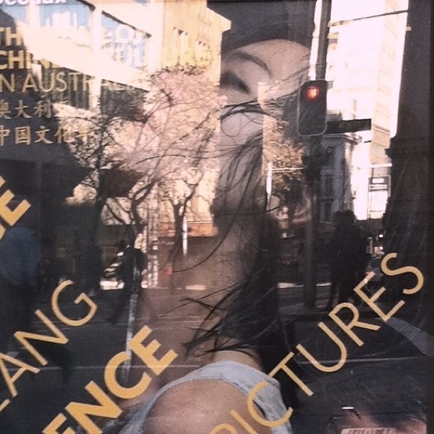
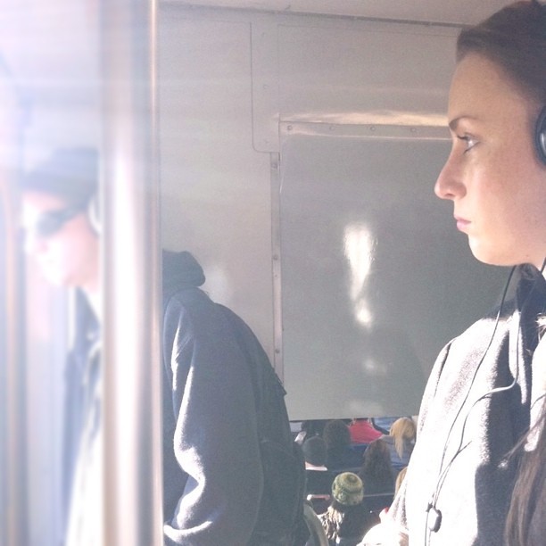
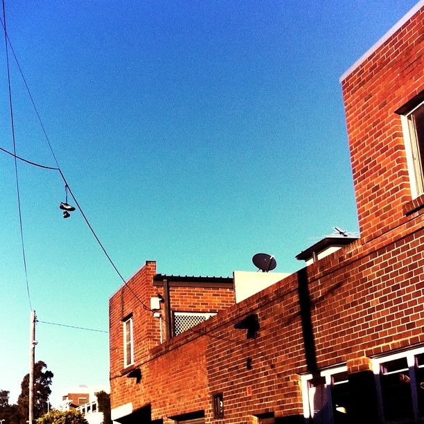
Between June and August 2011, my aim was to get my Instagram photo count up to 100 by capturing and processing an image with my iPhone 4 on average one per day. Below are 20 of my favorites with a some of my thoughts.
All of these photos were captured and processed with my iPhone 4. I captured the images with Camera+ and used a combination of Camera+, Filterstorm and Snapseed for prost processing. Every day I would train my eye to be on the lookout for interesting compositional elements around me and take a picture of it: on the way to and from work, out shopping, eating, waiting…everywhere.
The limitations of the iPhone camera are its strengths: long start-up time, slow shutter response, it is noisy, it doesn’t have optical zoom, its lens distorts things badly, it over-processes colours. Because of all these things it does badly, every picture taken with it can focus on the basics of photography that don’t rely on any of these bells and whistles: composition. No need to worry about freezing motion, or capturing the colours of a sunset, or turning that waterfall silky smooth…just worry about the design elements and composition: rule of thirds, leading lines, balance, repeating shapes and form, contrast, colour, negative space etc etc.
By no means are these amazing images - they are more like interesting sentences that don’t fit together into a paragraph. In each of them, I tried to pick out a design / compositional element from what I saw in my environment and incorporate that element into an image. The goal was to become better and quicker at picking out these elements.
I think with cameras as amazing as they are nowadays, a clean, well exposed image is not enough. The true differentiation now between a good image and a mediocre one is the moment it captures and the design elements used to present and enhance that moment. This is the key reason these images are not great, because there is no real intentional connection between the moment and the design elements - for most of them, there are no moments captured at all only compositional elements.
I did learn a lot from this exercise and would recommend it to anyone interested in improving their photography. A 5 megapixel camera goes a long way.
