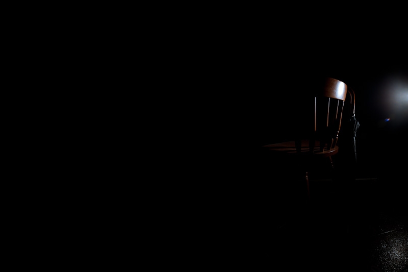
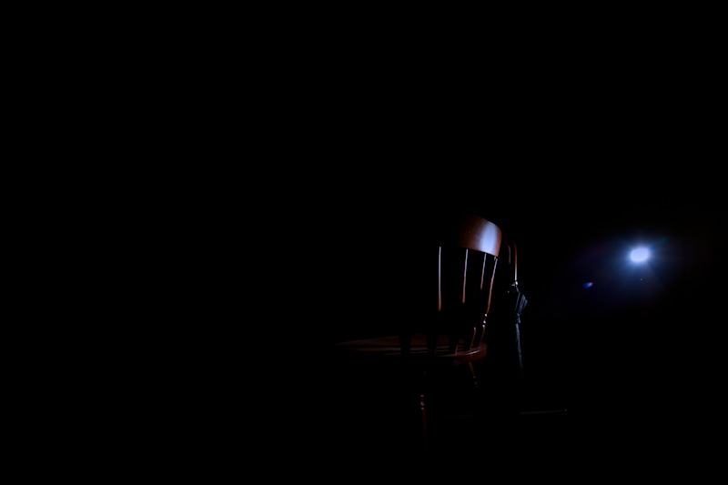
Lighting a chair
I was practicing lighting…trying to create negative space by selectively lighting. I started off with a softbox but the room was too small to create the desolate look I wanted. So instead I shot straight zoomed in with a bare SB-900. The results were much better. The desolate look was instead created in photoshop. Very rough photoshopping.
I’m a fan of negative space. The nothingness just adds to an image in a nice calm way…somehow. When I do portraits I’m going to be looking for nice ways to turn backgrounds into nice textured negative space. In my mind at the moment it will probably be done with a combination of depth of field and/or composing in fron of backgrounds that have a very different ratio to my subject and blowing it out or darkening it out as the case may be.
I kind of like the way the reflection of the speed light grounds this image, gives it a lot more context.

I like the way the one below looks like it only exists momentarily because of the light. I don’t know why I added the blue to the highlights, just felt cool…industrial I guess.

The photoshop jobs are rough, but I’m glad I was able to create 90% of what I was picturing in my mind.
Oh, and I started using Lightroom. The development feels a lot more photographer focused i.e. adjustment/development tools and options make a lot more sense. But Aperture’s UI and metadata creation, finding, filtering etc is way better.