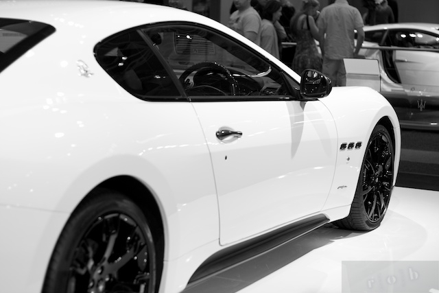
2010 Australian International Motor Show
Another late post (the Show was on 17 October).
This is the first time I was in an indoor environment where there was plenty of lighting. Just some thoughts…
I learned how bad the metering was when shooting reflective car surfaces. I had not been forced to experiment with the different metering modes available. It really highlighted how little I knew about it.
I learnt how important it was to fully understand the camera as I was forced to use manual mode most of the time. Really slowed down the process as I always had to do multiple test shots. I hear the pros saying it’s almos second nature for them to be able to pick out the f-stop and shutter speed given a particular scene. Something to strive towards.
50mm lens on a crop sensor body is really not cool when you have the ability get close to the subject and not much room to move (given other people and car displays don’t allow you to step back). Come to think about it, a wide angle or even fisheye lens would have allowed much more creative pictures. Then again, the 50mm lens meant that it was hard to get complete pictures of the cars as standing too far back would encourage people to walk in front of you, so the result was I was forced to choose to focus on the most interesting part of the cars.

I chose to use black and white in the picture above because the car was white and the background colour just distracted from the car (lime green Lamborghini in particular). The edge sharpening tool was really useful as it brought out the details in the wheels and other bold lines. I’m pretty happy with it. Although, I wonder if increasing the contrast and decreasing the brightness would make the image “pop” that little more. I don’t know if losing some of the finer details would be worth it though.
Another thing I would note is that, in the same way portraiture photography should focus on the eyes, car photography should focus on the things that defines the car. In the image above, given the shallow depth of field, I would change it by making the three chrome-ringed air vents the main focus rather than the wing mirror. However, would that give too much blur in the extreme foreground of the picture? That might be a desirable effect as it draws the eye naturally to the focus even more than it does as it is now.
No cropping required though! Happy about that!